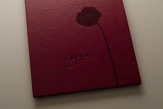
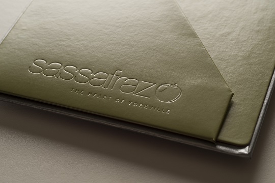
Why should designers and printers be interested in restaurant menus? Simply put, restaurants are constantly raising the bar with better designed dining rooms, updating their offerings, more focused images, etc. An important part of conveying a restaurant’s image is having better designed and more unusual and creative menus!
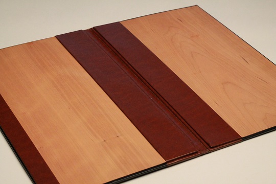
The menu shown above is unique because of the warm wood veneer accents
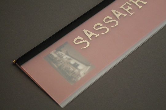
The menu shown above has a vellum cover and an elastic that holds the sheets in the menu
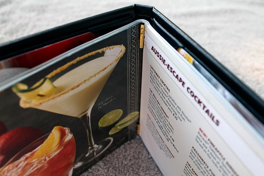
The Outback Steakhouse menu shown in the image above is designed so that anyone can easily add or subtract sheets
The menus we make aren’t your average kind. We can handle quantities from 50 to 5000. Restaurants, like all businesses, are increasingly fighting for more customers. Designing and manufacturing menus could be another market for you!
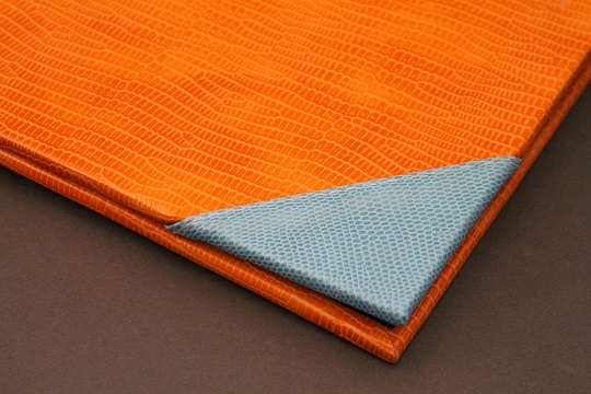
The menu shown above has two vibrant colours of faux leather
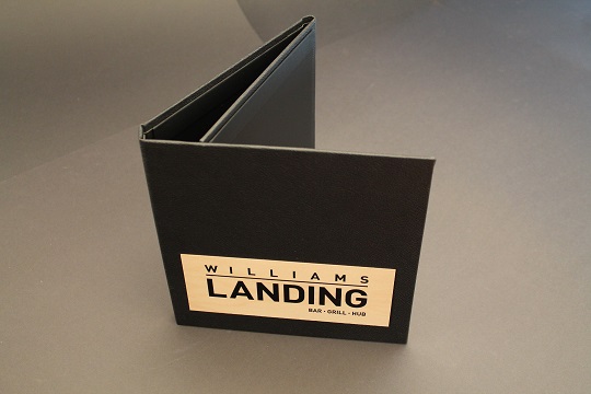
The menu shown above has a wood veneer plate on the front cover
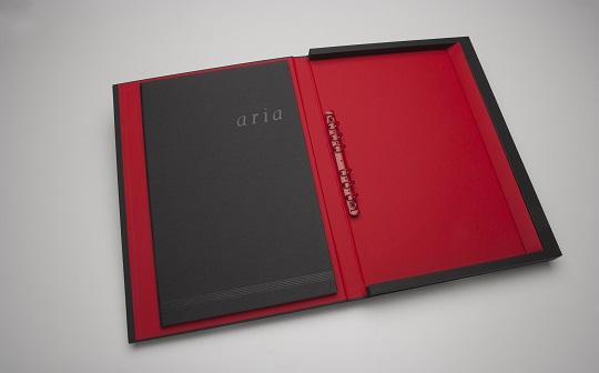
I can definitely say that the red ring menu above is most definitely unique and my favourite!
There are all sorts of menus out there and many of them are poorly designed! Many menus fall apart easily, pages are a hassle to add or remove or don’t reflect well on the restaurant. A good menu, to varying degrees, needs to have at least five qualities:
- The sheets need to be easily added and removed
- Be reasonably durable
- Must reflect the restaurant’s image and must stand out from the competition
- Must feel good when handled … no rough surfaces and no sharp edges
- Be somewhat grease/spill resistant
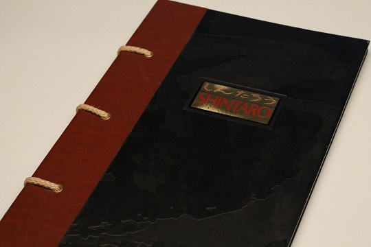
The Japanese restaurant menu shown above has a foil stamped cover
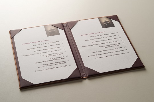
The wine menu shown above has “picture corners” that hold the menu sheets in place
The menu shown above has a clear foil stamped logo on the front
The bar menu shown above has a stamped restaurant name and uses two colours of pearlized stock
