In 2016 I did an Eblast about menus and why they should be of interest to graphic designers and printers. The restaurant menu market continues to grow! Increasingly people are “eating out.” Increasingly people want something new. Increasingly people want a better experience. Part of the “restaurant experience” is the physical menu.
Our supplies are consistently expanding the number of colours of materials. Restaurant owners continue to want something different; something to differentiate their restaurant from the “pack.”
The following pictures of 9 different menu styles show 9 different colours and 9 different styles.
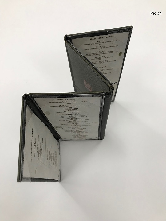
Picture #1, is a four-panel, edge sewn menu, with a set of “four corners,” clear insert corners to facilitate the addition or removal of menu sheets.
Picture #2 is constructed with two different materials in two contrasting colours, designed as an accordion style fold rather than a roll fold.

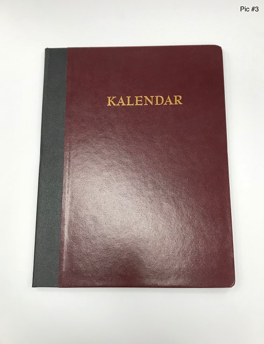
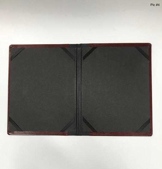
Pictures #3 and #4 consists of a case wrapped cover, taped “spine” and an interior of a two panel “elastic” corners.
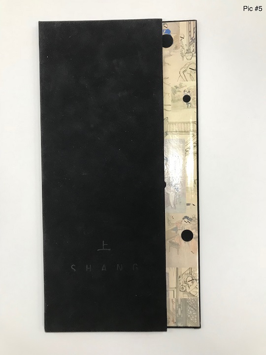
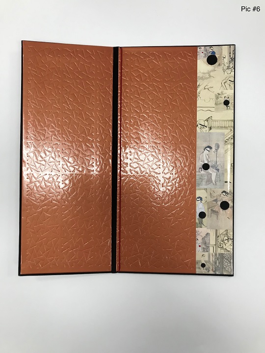
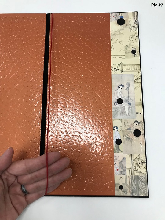
Pictures #5 to #7 is constructed with three kinds of “wrap material,”
- Velvet (back)
- Embossed, plasticized cover material (orange)
- Printed paper (far right)
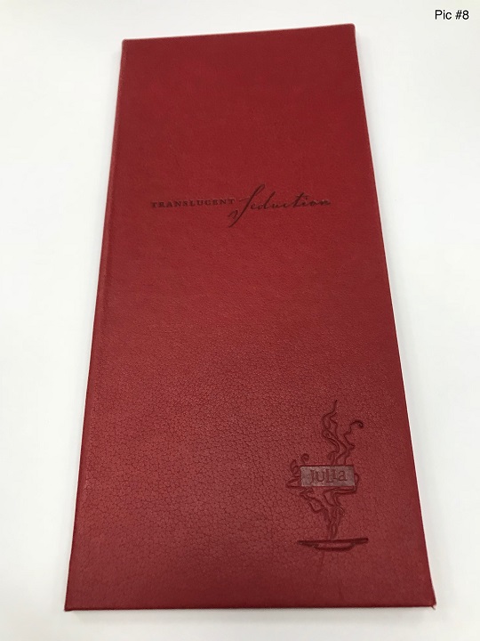
Picture #8 is a case wrapped menu, which makes for an unusually tall and narrow menu.
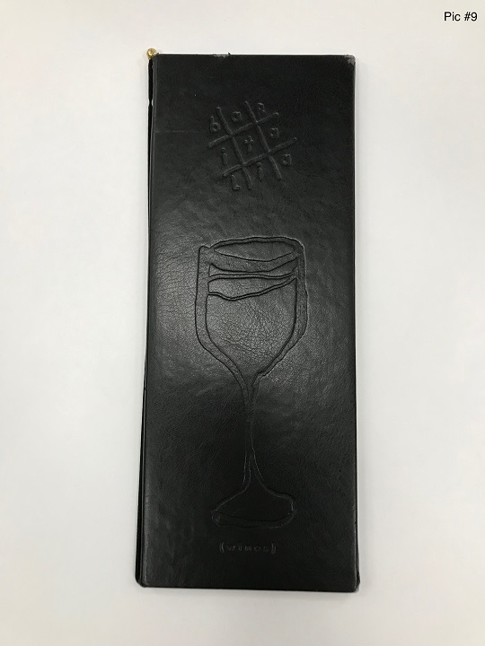
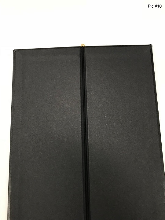
Pictures #9 and #10 is case wrapped with an imitation leather like material, debossed and lined with thick paper.
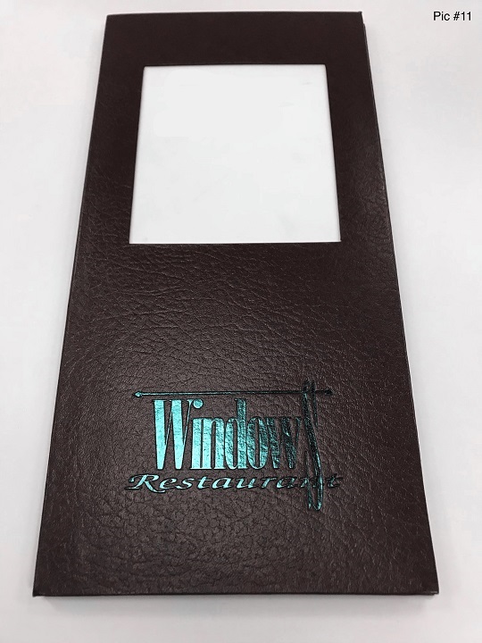
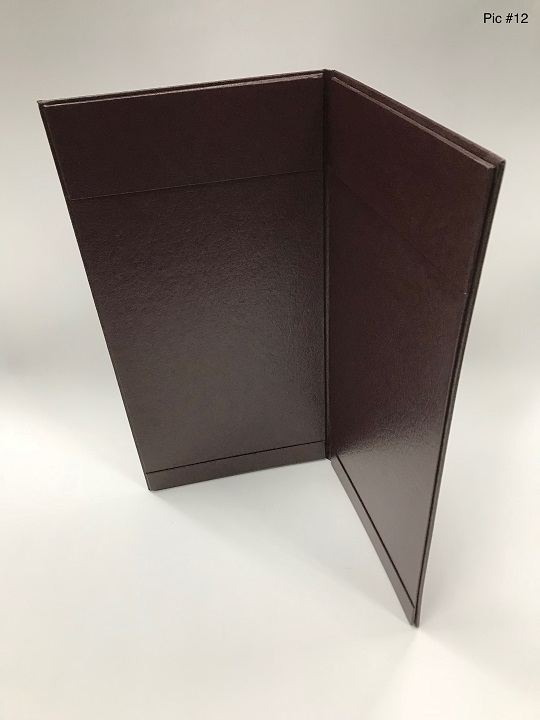
Pictures #11 and #12 is foil stamped, die cut “windowed” and lined with a contrasting material.
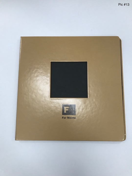
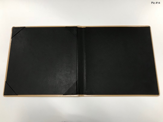
Pictures #13 and #14 is round cornered, foil stamped, windowed, wrapped with “corporate coloured matched” material and lined with suede like material.
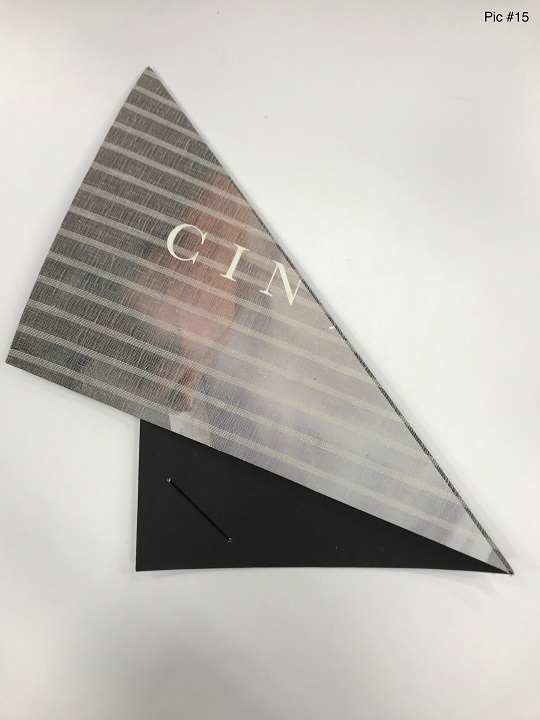
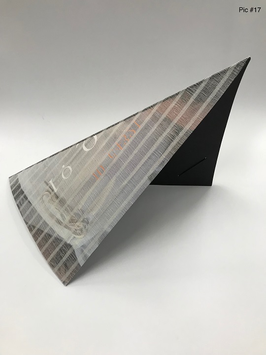
Pictures #15 to #17 is a wild one! Mounted with “mesh-like” material on one side, patterned clothe on the reverse, die-creased and folded down the long side…100% different! Coloured “elastics” were “metal eyelet” and inserted at the opposite corners. The printed menu sheet is folded the same way and inserted into the elastic corners.

There are all sorts of menus out there and many of them are poorly designed! Many menus fall apart too easily, pages are a hassle to add or remove or the menus don’t reflect well on the restaurant. A good menu, to varying degrees, needs to have at least five qualities:
- The sheets need to be easily added and removed
- Be reasonably durable
- Must reflect the restaurant’s image and must stand out from the competition
- Must feel good when handled…no rough surfaces and no sharp edges
- Be somewhat grease/spill resistant